Did you know that ui psychology will shape 80% of B2B sales interactions by 2025? This shift to digital channels highlights why understanding the hidden psychological triggers behind user interfaces is no longer optional for businesses seeking growth.
While most companies focus on creating visually appealing designs, the true conversion power lies in ui design psychology principles that influence user behavior. Studies show that the average person reads at least 10 online reviews before making a purchase decision, and 57% of customers will only use services with 4-star ratings or higher. Furthermore, effective ui ux psychology implementation can significantly improve conversion rates, which typically range from 2% to 5% depending on your industry.
We’ve discovered that psychological principles like the Peak-End Rule and the principle of least effort essentially determine whether users convert or abandon your site. By understanding ux ui psychology requirements like reducing cognitive load, simplifying navigation, and strategically applying color psychology, we can create interfaces that not only look good but actually drive measurable results.
In this article, we’ll explore the hidden psychological triggers that influence user decisions and how you can apply these principles to boost your conversion rates in an increasingly digital marketplace.
Understanding the Role of Psychology in UI Design
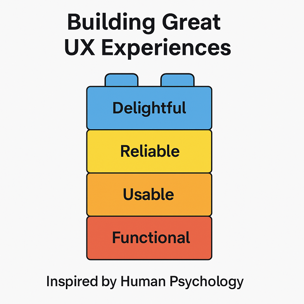
Psychology in interface design goes far beyond making elements look attractive. The human brain processes interfaces through specific mental shortcuts that directly impact conversion rates. According to research, the average human attention span has significantly decreased to just 8.25 seconds between 2000 and 2015, making psychological optimization of interfaces more crucial than ever.
Cognitive Biases and Familiarity in Interface Design
Cognitive biases are systematic patterns that cause our brains to deviate from rational judgment when interacting with interfaces. These biases significantly influence how users perceive and use your product. Confirmation bias, for instance, leads users to favor information and features that align with their existing beliefs, potentially causing them to miss beneficial functionalities.
Familiarity plays a critical role in ui psychology. Jacob’s Law states that “Users spend most of their time on other sites. This means that users prefer your site to work the same way as all the other sites they already know”. When interfaces leverage existing mental models, users can focus on their tasks rather than learning new models. This principle explains why utilizing established design patterns reduces learning curves and improves usage speed – particularly important for senior users who find learning new interfaces challenging.
Cognitive load—the total mental effort required in working memory—comes in three forms: intrinsic, extraneous, and germane. By reducing cognitive strain through clear language and streamlined designs, we can make interfaces feel easier to use.
Emotional Triggers and User Decision-Making
Emotional design transcends functionality to create meaningful connections with users. Don Norman’s emotional design framework operates on three levels:
- Visceral level: Immediate emotional responses to esthetics and sensory elements
- Behavioral level: Emotions during interaction related to usability and goal achievement
- Reflective level: Long-term emotional connection after interaction
Emotions directly influence decision-making in interfaces. For example, trust—a critical emotion—can be established through familiar design patterns, clear privacy policies, and secure transaction symbols. Additionally, microinteractions (small design elements like animations or haptic feedback) can transform mundane interactions into moments of joy, consequently strengthening user engagement.
Behavioral Economics in Microinteractions
Behavioral economics reveals that users don’t always make rational decisions. Unlike traditional economic models that assume logical behavior, behavioral economics acknowledges that users rely on mental shortcuts influenced by biases.
The principle of loss aversion demonstrates that users feel the pain of loss more intensely than the pleasure of equivalent gains. This explains why messaging that highlights what users might lose by not taking action (like missing a deadline or deal) often drives stronger conversions.
Default bias also plays a significant role—users typically stick with preset options. Thoughtfully designed defaults can nudge users toward preferred choices without restricting their freedom. Similarly, anchoring (where users rely heavily on the first information they encounter) can guide them toward premium plans or desired actions.
Small, strategic nudges in microinteractions can gently steer users toward better or more desirable actions while still leaving them in control. For example, progress bars can increase task completion by signaling momentum, consequently encouraging users to finish what they’ve started.
Understanding these psychological principles isn’t about manipulation—it’s about designing with human behavior in mind to create interfaces that feel intuitive and drive measurable results.
Core Psychological Principles That Influence Conversions
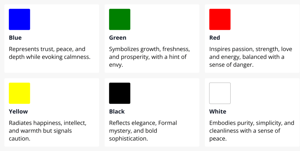
Four key psychological principles serve as the foundation for effective conversion-focused interfaces. I’ve found these principles aren’t just theoretical concepts—they directly impact how users make decisions when interacting with your interface.
Hick’s Law in Reducing Decision Fatigue
Hick’s Law explains why providing too many options to users can be detrimental to conversions. First formulated in 1952, this principle establishes a scientific connection between stimuli and reaction time. When users face excessive choices, they experience “analysis paralysis”—overthinking that impedes decision-making ability and creates friction in the user journey. This psychological phenomenon shows that the time required to make a decision increases logarithmically as the number of choices grows.
Therefore, to improve conversions, we should limit options to 6-7 choices per viewport. Amazon’s checkout process exemplifies this principle by dividing the process into clear steps with minimal options at each stage. Moreover, when limitation isn’t possible, presenting choices hierarchically with the preferred conversion path made larger and more obvious becomes essential.
Fitts’s Law for Optimizing Click Targets
Fitts’s Law gives us a mathematical relationship between the time required to reach a target and both its size and distance. The formula states that t = a + b * log₂(1+d/w), where t is time, d is distance to target, w is target width, and a and b are device-specific constants.
This principle yields two crucial insights for ui design psychology: bigger targets are faster to acquire, and closer targets reduce interaction time. In fact, screen edges act as “infinite targets” because they naturally stop cursor movement, making corners and edges particularly valuable for important interface elements.
Given these points, we can optimize conversion elements by:
- Making primary call-to-action buttons larger than secondary options
- Positioning critical interactive elements at screen edges when possible
- Ensuring adequate spacing between closely positioned targets to prevent accidental clicks
Gestalt Principles for Visual Grouping
Gestalt principles explain how humans perceive and organize visual information. Formulated by Max Wertheimer and later improved by Wolfgang Köhler and others, these principles show how we unconsciously connect design elements.
The principle of similarity reveals that users perceive similar elements (in shape, color, or size) as a complete picture or group, even when separated. Subsequently, we can use this to build visual connections between related elements like navigation items. Proximity teaches that objects grouped closely together are perceived as a whole—vital for creating logical groupings without explicit borders.
Closure demonstrates how our brains fill in missing parts of a design to perceive a complete image. Furthermore, continuity shows that the human eye naturally follows lines or curves, even when they intersect with other elements—guiding users through an interface.
Serial Position Effect in Menu Design
The serial position effect, coined by Hermann Ebbinghaus, reveals that users better remember items positioned first (primacy effect) or last (recency effect) in a series. This cognitive bias influences how we prioritize information when handling significant data at once.
In practice, on YouTube’s navigation menu, the most important items (Home, Shorts, Subscriptions) appear first, while utility pages (Settings, Help) appear last. Likewise, following Miller’s Law, which states our working memory can only hold 5-9 items, we should keep menus concise.
Ultimately, by placing key navigation elements at the beginning or end of menus and limiting total items to 3-5, we create interfaces that work in harmony with users’ natural memory patterns.
Designing for Emotion, Trust, and Motivation
Beyond logic and functionality, effective interfaces tap into human emotions to drive conversions. The brain processes emotional information faster than rational data, making emotional design a powerful tool in ui psychology.
Color Psychology and Emotional Associations
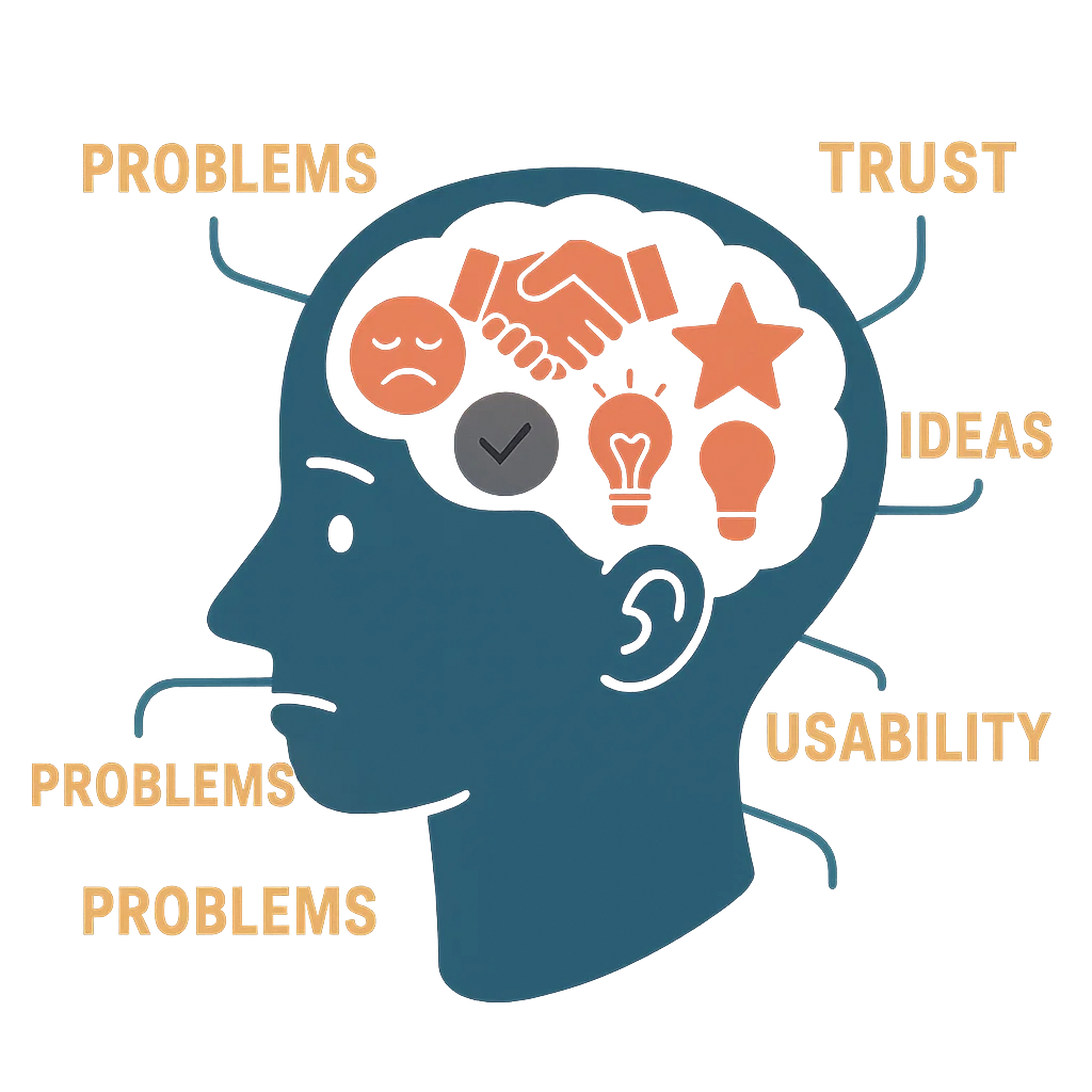
Colors aren’t just esthetic choices—they’re psychological triggers that significantly influence user behavior. Each color evokes specific emotional responses: red generates excitement and urgency, blue builds trust and dependability, green conveys growth and harmony, while yellow creates optimism and warmth. These associations have evolutionary roots—red connects to blood and fire, triggering primal fight-or-flight responses, whereas green links to nature, evoking tranquility.
Nevertheless, cultural context matters tremendously. In Western cultures, white symbolizes purity, whereas in some Eastern cultures, it represents mourning. This makes understanding your audience essential before implementing color schemes in ui design psychology.
Visual Hierarchy to Guide User Attention
Visual hierarchy strategically organizes interface elements to direct users’ focus toward conversion-critical components. Unlike computers, humans perceive information visually rather than as data blocks, making proper hierarchy crucial.
Several factors contribute to effective visual hierarchy:
- Size: Larger elements dominate and catch attention first
- Contrast: Stark differences between elements draw eyes to brighter components
- Whitespace: The space around content both eases information digestion and helps the eye focus on specific areas
- Alignment: Creates order and establishes priority between elements
Without clear visual hierarchy, users struggle to find focus on a screen. Accordingly, applying deliberate contrast in value and saturation between elements and their surroundings creates the visual structure that guides user attention effectively.
Social Proof as a Trust Signal
Trust signals tell users your product is reliable and worthy of their investment. Social proof—showing that others value your product—is perhaps the most powerful trust mechanism. With 84% of shoppers checking online reviews for local businesses, incorporating social proof is no longer optional.
Effective social proof includes client logos (with context), testimonials (with real names and specifics), case studies (showing complete customer journeys), and third-party reviews. Importantly, avoid generic testimonials lacking specificity, outdated data, or manipulated statistics—these damage credibility more than they build trust.
Gamification for Sustained Engagement
Gamification incorporates game elements into non-gaming contexts to boost motivation and engagement. Elements like points, badges, leaderboards, and leveling systems tap into users’ intrinsic desires for achievement and recognition.
Celebrating milestones with animations or rewards makes users feel you’re invested in their success. Asana exemplifies this with their “celebration creatures”—little monsters that appear when users complete tasks, adding personality while reinforcing positive behaviors.
In essence, emotional design transcends functionality to create meaningful connections that drive conversions in ui ux psychology.
Reducing Cognitive Load Through Smart UI Choices

Cognitive load remains a precious resource in ui psychology, with research showing that users’ working memory can only handle limited information at once. The smart UI designer treats user attention as a valuable commodity to be carefully managed through strategic interface choices.
Progressive Disclosure in Complex Interfaces
Progressive disclosure helps prevent overwhelm by revealing only essential information upfront, with deeper options available on demand. This technique declutters the UI, stopping confusion and cognitive overload that might otherwise derail users’ thought processes. Instead of bombarding users with every feature simultaneously, progressive disclosure presents content when needed, improving the learning curve for complex applications. This approach benefits both novice users focusing on basic functions and experienced users seeking advanced capabilities.
Multi-step forms exemplify progressive disclosure in action, breaking complex tasks into manageable chunks. Meanwhile, contextual help through tooltips, popups, and hotspots guides users through tasks without overwhelming them with instructions.
Chunking Content for Better Comprehension
Chunking divides information into clearly distinct groups of related content. Users appreciate chunked text since it helps avoid intimidating walls of text. Effective chunking uses short paragraphs separated by white space, text lines of 50-75 characters, and clear visual hierarchies.
Although seemingly counterintuitive to break up information, chunking leads to more focus and faster progression. This technique becomes increasingly vital as human attention spans have dropped to just 8 seconds—shorter than those of goldfish.
Clear Navigation Paths to Prevent Drop-offs
Straightforward navigation paths create confidence in users as they move through interfaces. A confusing checkout process often leads to abandoned shopping carts, whereas simplifying the journey and minimizing steps contributes to a smoother transaction process.
Analyzing drop-off points helps identify friction in the user experience. Through funnel analysis, path analysis, and heatmaps, designers can pinpoint exactly where users abandon features, thus creating interfaces that work in harmony with users’ natural cognitive processes.
Case Studies: How Top Brands Apply UI Psychology
Leading brands consistently apply ui psychology principles to create exceptional user experiences. Let’s examine how these companies leverage specific psychological techniques in their interfaces to drive user engagement and conversions.
Airbnb: Trust and Social Proof in Listings
Airbnb’s success hinges on solving a fundamental psychological barrier—convincing people to stay in strangers’ homes. According to Joe Gebbia, Airbnb co-founder, the platform systematically dismantles the “stranger danger” instinct through thoughtful interface design. Notably, more than 50% of their listing page focuses not on the room itself but on trust signals. The platform strategically displays three primary trust elements: reviews from similar users, host profile photos, and overall ratings—all before showing property details. This approach reflects Stanford University research showing we instinctively trust people who feel similar to ourselves. Furthermore, Airbnb displays how long reviewers have been using the platform, creating another subtle trust signal that validates opinions.
Spotify: Gamification and Personalization
Spotify applies machine learning to create what could be described as 381 million individual versions of their platform—one for each user. Their personalization design team focuses on making AI-driven recommendations feel “human” through thoughtful interface choices. Behind the scenes, Spotify processes nearly half a trillion events daily to power these recommendations. Importantly, they use reinforcement learning (RL) models that optimize for long-term user satisfaction rather than short-term engagement. This approach creates what they call a “sustainable, diverse, and fulfilling content diet” instead of merely serving “empty calories” of momentarily satisfying content.
Duolingo: Zeigarnik Effect and Feedback Loops
Duolingo masterfully employs the Zeigarnik effect—our tendency to remember uncompleted tasks better than completed ones. Their interface provides clear visual cues for lesson completion alongside overview screens showing progress. Internal motivation primarily drives this effect, yet Duolingo counters potential motivation issues by layering external motivators throughout their interface. These include community rankings, friend quests, and story completion challenges. Additionally, Duolingo emphasizes recognition over recall by providing vocabulary lists and audio recordings, making language learning more accessible and confidence-building.
Netflix: Serial Positioning and Content Discovery
Netflix employs sophisticated recommendation systems driving over 80% of content watched on their platform. Recently, they began testing AI-powered search functionality developed with OpenAI that enables natural language queries based on mood or theme instead of traditional parameters like show names. Their autoplay feature exemplifies the Zeigarnik effect in action—automatically playing the next episode before the current one concludes creates a seamless viewing experience that capitalizes on users’ completion tendency.
Conclusion
Understanding the psychological underpinnings of UI design transforms ordinary interfaces into conversion powerhouses. Throughout this article, we’ve explored how cognitive biases, emotional triggers, and behavioral economics principles shape user decisions in profound ways. These psychological factors ultimately determine whether users convert or abandon your platform.
The evidence speaks for itself. Companies like Airbnb strategically leverage trust signals to overcome inherent psychological barriers, while Spotify creates personalized experiences that feel remarkably human. Duolingo masterfully applies the Zeigarnik effect, and Netflix employs sophisticated recommendation systems based on serial positioning principles.
You now possess knowledge of critical psychological tools—Hick’s Law for reducing decision fatigue, Fitts’s Law for optimizing click targets, and Gestalt principles for effective visual grouping. Additionally, techniques like progressive disclosure, content chunking, and clear navigation paths significantly reduce cognitive load, making interfaces feel effortless and intuitive.
Beyond esthetics, effective UI design taps into fundamental human psychology. Color choices trigger specific emotional responses, visual hierarchy guides attention to conversion-critical elements, and social proof builds essential trust with users. Consequently, these principles work together to create interfaces that feel natural and compelling.
The future of UI design clearly belongs to those who understand not just what looks good, but what feels right psychologically. As digital interactions continue dominating business relationships, your ability to apply these psychological principles will undoubtedly determine your conversion success. The difference between mediocre and exceptional results lies not in visual appeal alone, but in how deeply your interface resonates with users’ psychological needs and behaviors.
FAQs
Q1. How does color psychology influence user behavior in UI design?
Colors evoke specific emotional responses that can impact user decisions. For example, red can create a sense of urgency, blue builds trust, and green conveys growth. However, it’s crucial to consider cultural context when implementing color schemes, as color associations can vary across different cultures.
Q2. What is the Zeigarnik effect and how is it used in UI design?
The Zeigarnik effect is our tendency to remember uncompleted tasks better than completed ones. Apps like Duolingo leverage this by providing clear visual cues for lesson completion and progress tracking, which motivates users to finish what they’ve started and continue engaging with the platform.
Q3. How can reducing cognitive load improve user experience?
Reducing cognitive load helps prevent user overwhelm and improves focus. Techniques like progressive disclosure, which reveals information gradually, and content chunking, which breaks information into manageable groups, can significantly enhance user comprehension and navigation through complex interfaces.
Q4. What role does social proof play in building trust through UI design?
Social proof is a powerful trust signal in UI design. Incorporating elements like client logos, specific testimonials, case studies, and third-party reviews can significantly influence user decisions. With a high percentage of users checking online reviews before making decisions, social proof has become essential for building credibility and driving conversions.
Q5. How do companies like Netflix use psychological principles in their UI?
Netflix applies principles like the serial position effect in their content discovery system. They also use sophisticated recommendation algorithms and features like autoplay, which leverages the Zeigarnik effect to create a seamless viewing experience. These psychological tactics help keep users engaged and increase content consumption on the platform.

